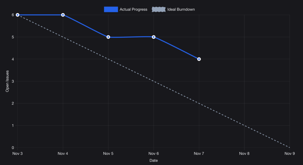
Burndown & Burnup Charts in GitHub
Why these charts matter
Burndown and Burnup charts are the heartbeat of agile planning. They show whether your team is on track, how much work remains, and how scope changes affect delivery.
- Burndown: tracks how quickly work is completed.
- Burnup: shows progress against the total scope, making scope creep visible.
Both are essential for retrospectives, sprint reviews, and honest conversations about predictability.
The challenge with GitHub
GitHub is where your team works. But when it comes to sprint tracking, it leaves you guessing.
- No native burndown or burnup charts
- Only rudimentary “Insights” that don’t reflect agile practice
- Manual exports to Excel or third-party boards
Scrum Masters end up spending more time building charts than using them.
How Flow2C helps
Flow2C gives you Burndown and Burnup charts directly from your GitHub data.
- Real-time updates: charts evolve as your team works
- Scope awareness: see when new issues are added mid-sprint
- Retrospective-ready: use charts as a neutral basis for team reflection
👉 You’ll have a shared view of progress.

From charts to clarity
Charts are not about control. They’re about transparency.
- Burndown: Are we closing work at the pace we expected?
- Burnup: Did scope change, or did we slow down?
- Together: A complete picture of delivery and planning reliability.
Flow2C turns raw issue data into visual stories your team can trust.
Try Flow2C for free
Connect your GitHub projects in minutes and see your Burnup & Burndown Charts instantly.